
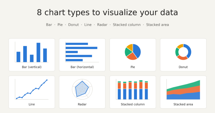
8 charts one can use to present data
Volume 29, Issue 04, 02 October 2026
There are different types of charts anyone can use to visualize their data. The most common and popular type of chart that people use in their daily life are: Bar charts, Pie charts, and Line graphs.
Bar charts: These are one of the easiest charts that can be created quickly with less effort. It is best used when you want to show amount (in y axis) of something(s). They can either be horizontal (categories on the y axis, metrics on the x-axis) or vertical (categories on the x-axis, metrics on the y-axis).


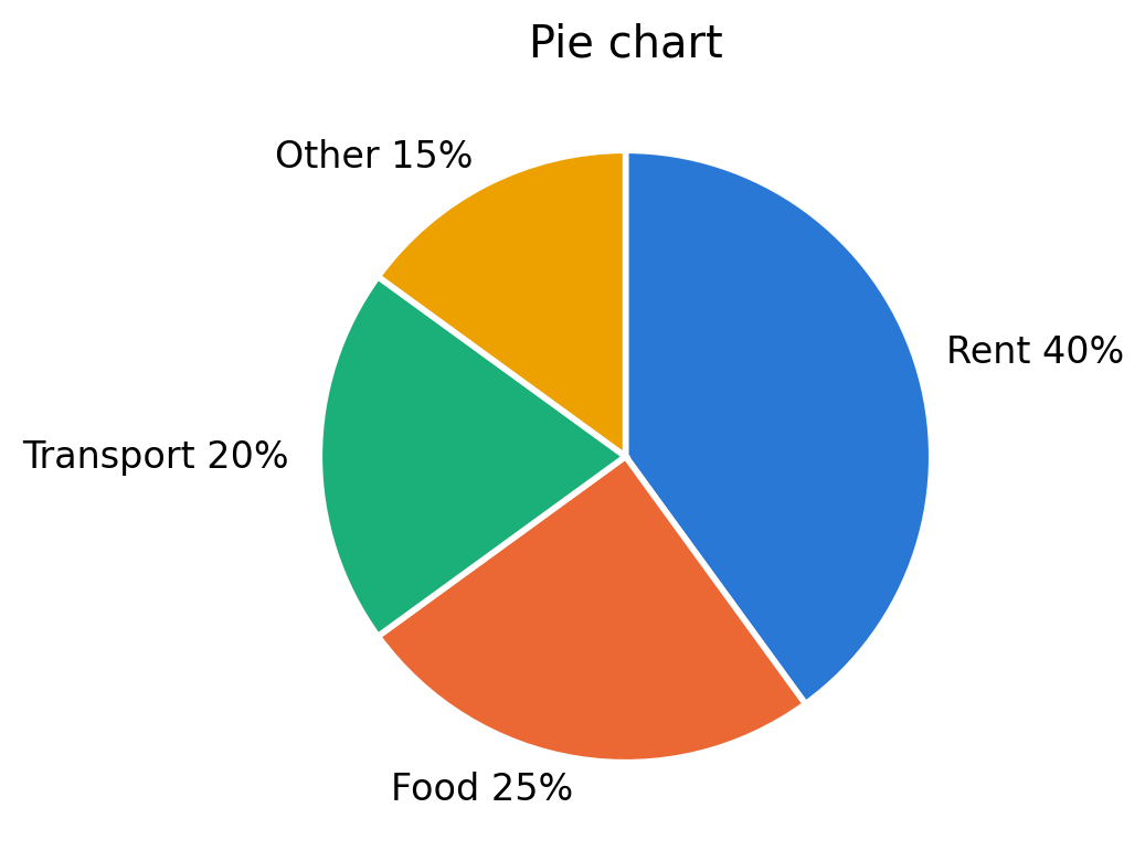
Pie Charts: If someone doesn’t live under the rock, then they probably already know about Pie charts. But, if in case, someone does live under the rock, here’s pie chart in one sentence: Pie charts are the charts that show what the whole “pie” is made up of (some percentages of 100%), and whose total is always 100%.
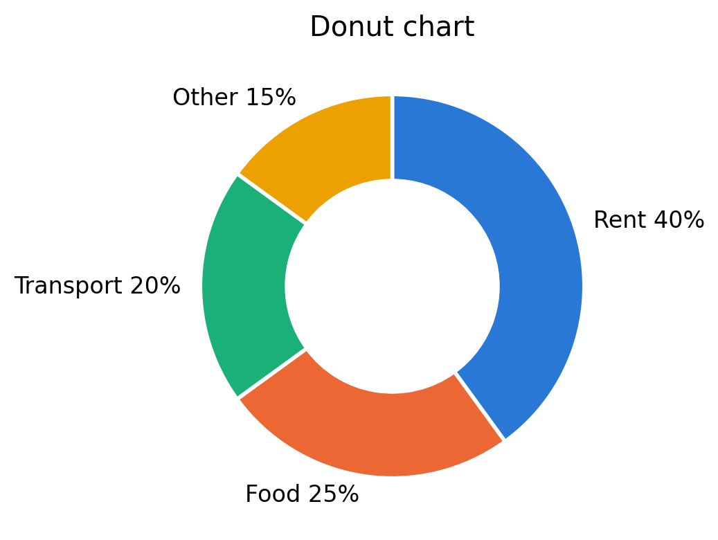
Donut Chart: There is a chart so similar to Pie chart, that I call it the skinny brother of Pie chart. It’s called a donut chart. It is a pie chart, with the only difference being the hole in the middle of the chart, making it look like a donut.
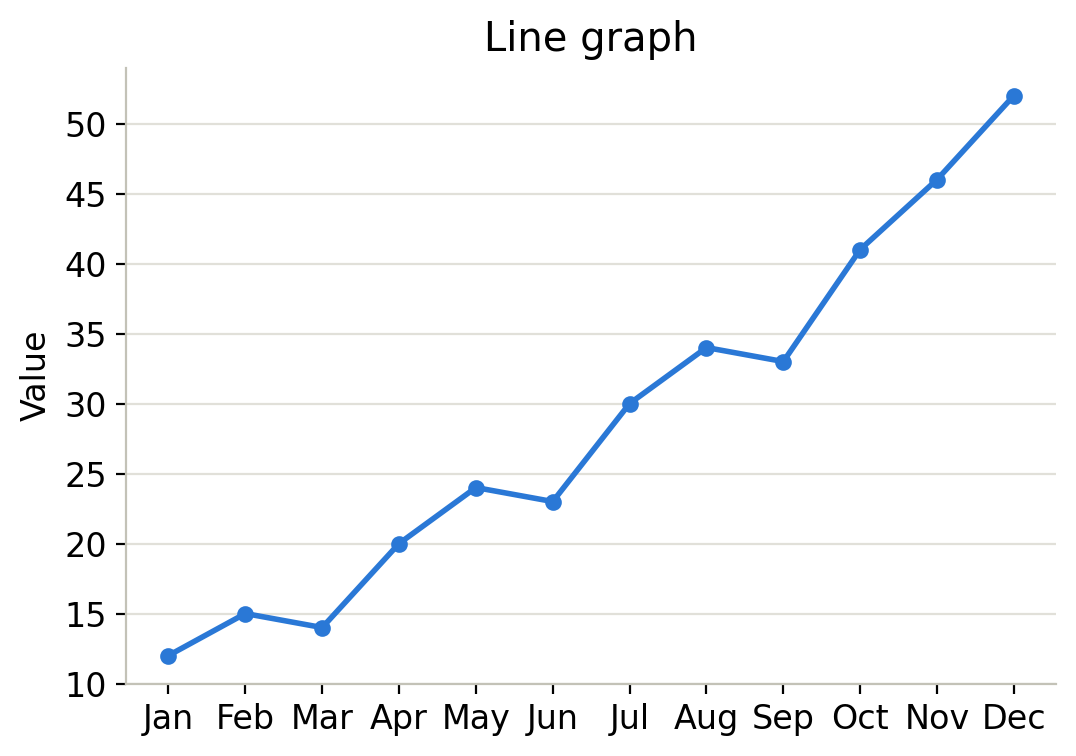
Line charts/graphs: The most useful tool for showing data that is represented in dates, days and months in a continuous way is a line graph. It can be best used for showing the change in data from a starting date and time to an ending date and time.
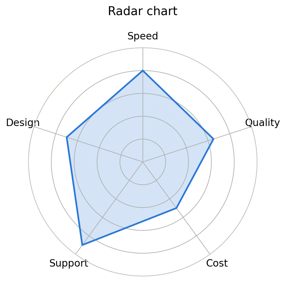
Radar chart is one of my personal favourites. It is the chart which shows the data in a pentagon. The pentagram has lines coming from its centre to its border. Each of those lines represent the dimensions. The metrics are put somewhere along those lines.
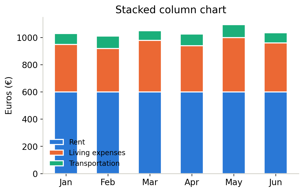
Stacked column charts are similar to Bar charts. The only difference is in how each column is presented. Everything else is the same in Stacked column charts, except each column is divided into different categories. For example: Each column that represents each month in a year could be divided into rent, living expenses and transportation fees on the x-axis whereas the y-axis shows the amount in euros.
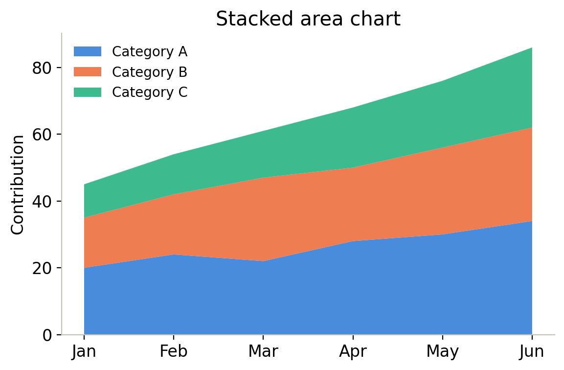
Stacked Area Chart: Last chart on this article is the Stacked Area chart, which shows multiples line graphs in one graph, and the area up to each line graph is coloured differently. This chart is best used for showing how much did a category contribute over the timeline that is on the x-axis.

- Let’s learn Finnish Together! - 23rd October 2026
- Was it a bird? Was it a Plane? No, it was the Patteri ES Speakspace event - 16th October 2026
- Breathtaking videogame that anyone can play for free - 9th October 2026